Societal Metabolism Analysis @ Hutton
Exploring how policy can shape social ecological systems to make them more sustainable
Societal Metabolism Analysis offers a new a way to undertake sustainability assessment, recognising the interactions across sectors and scales and considering both the bio- and technospheres.
Societal Metabolism Analysis has been used @Huttonin theMAGIC projectto look at how EU sustainability objectives are delivered via policies such as theCAP.
About
Societal Metabolism Analysis (SMA) is a new form of sustainability assessment providing a coherent way to characterise and understand the consumption and production of resources in coupled social-ecological systems (their metabolic patterns). SMA particularly emphasises the need to look across geographical scales and between locations, to take multiple perspectives (production, supply and demand), and the need to consider limits within both the biosphere, technosphere. SMA reflects on the long-term feasibility and viability of existing and alternative social-ecological systems and how these issues are discussed in policy and other discourses (framing of sustainability narratives). For an introduction to the SMA for policy see apresentation to Scottish Government from Dec 2020.
Since Societal Metabolism Analysis is new and potentially of interest to a wide range of stakeholders, this site has been built to provide a single place to access materials from projects involving Hutton researchers.
The second purpose of the site is to make accessible online content from the sustainability assessments (seeApplications/Outputs below) that was not possible to include within the reports. This includes maps and other visualisations where a wide variety of potential combinations of variables and classifications can be employed such that an online interactive system has more potential. There is an ongoing challenge of how best to communicate the complex multi-dimensional outputs from SMA and the site also provides a way to share these experiments with a wider community.
About the Map
Introduction
The maps on this site are part of the analysis reported in MAGIC deliverable D5.1 Report on EU sustainability goals: insights from Quantitative Story Telling and WEFE nexus[1]. This was a pan-EU societal metabolism accounting undertaken using a specific instance of the tools and methods of MuSIASEM see Giampietro, Aria[2].
Read more about the methodologyhere.
Reading the Map
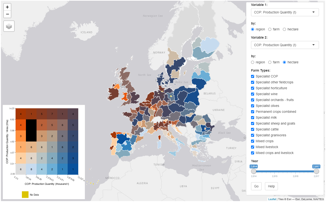
The maps in this report are mostly of the form as shown below. This shows the spatial pattern of a relationship between two variables. This can be in the form of two extent variables forming a relationship (a flow-fund ratio), for example, tonnes of grain vs hectares of land used to produce grain. This implicitly creates a rate map (in this example t/ha), whilst maintaining the two variable values defining that rate, therefore allowing distinction of high/high locations and low/low locations, which on a standard rate choropleth would occur in the same class. An alternative form of these maps is an extent vs intensity map. In this case, the overall production of a given flow (the supply of the flow) can be related to a series of benchmarks (the productivity per unit of fund or the requirement of inputs per unit of fund).
For example, the produced quantity of a given crop (extent) can be related to the yields of that specific crop or to the level of fertilisation, irrigation, pesticide application per hectare of that crop. In this way one can handle simultaneously qualitative aspects and quantitative aspects of the production process. For extent vs intensity maps, the extent variable is on the x axis of the legend (the size of the supplied flow), and the intensity variable (the benchmark determining the chosen flow/fund ratio) is shown on the y axis. These allow the display of both the share of the overall supply of the supplied flow from that region via the extent variable, as well as the pressure of use via intensity, e.g. tonnes of cereal, oilseeds and protein crops (COP) versus COP production per hectare as in the figure below.
The map contains several important components. The main display is of the mainland EU territory that is covered by the available data. The legend is created once 'GO' is pressed and loads in the bottom left corner. It contains up to 36 different colours, each being a combination of the two variables being displayed on the map. The left and bottom edges of the legend show the class boundaries for the mapping, with the classes on each axis containing 1/6 of the values for that variable. The number within the square indicates the number of regions that are within that class. A black box indicates no regions exist on that map with that combination of values. Yellow indicates no data is available for these variables, usually because there is insufficient data in the FADN survey to report on that variable. It can also be a result of combining data from other incompatible datasets, for example combining NUTS regions with FADN regions.
Click below for theinteractive map, with examples of common variable comparisons. For maximum interactivity and customisation,see this map instead.
Applications/Outputs
Here are some of our recent outputs.
Reports
People
We're a team of scientists working on cool stuff. You can see what we're working on and who's involvedhere.
References
-
Matthews, K.B., et al., Report on EU sustainability goals: insights from Quantitative Story Telling and the WEFE nexus. MAGIC (H2020–GA 689669) Project Deliverable 5.1. 2020. Online:https://magic-nexus.eu/documents/deliverable-51-report-eu-sustainability-goals. p. 136.
-
Giampietro, M., et al., Report on the Experience of Applications of the Nexus Structuring Space in Quantitative Storytelling. MAGIC (H2020–GA 689669), Project Deliverable 4.4. 2020. Online:http://magic-nexus.eu/documents/deliverable-44-report-nexus-structuring-space.
-
Cadillo Benalcazar, J., et al., Food Grammar.Resource Accounting for Sustainability Assessment, ed. M. Giampietro, et al. 2014, London: Routledge.